I’ve just completed a project to revamp the student finance section on the University of Greenwich website. Here’s more about the thought process and how it worked.
***
University websites are complex beasts – while they’re all of a kind, no two are exactly alike. We present things differently, we have different priorities, we tackle change at different pace, and sometimes our information sets differ slightly from each other.
This reflects the picture behind the scenes too. Universities throw different levels of resource at web and digital. Our teams or departments are often structured differently, or we end up working with agencies. Inevitably, we encounter different challenges.
Occasionally, we get to share our methods and approaches (at the annual IWMW conference, for example). But sometimes it’s just fun to explain what we’re working on. And perhaps I miss some of that from research days, where presenting work in progress is commonplace.
There are few good case studies of how to get started with the inner workings of a university website and how to bring about change. Why? Because the digital world is about looking forwards. There’s always more testing or optimising to do. Nobody’s looking back at what’s no longer there.
But change matters to me, as does my part in it. So I am!

Greenwich and Student Finance
The University of Greenwich is very different from the University of London web project I was involved with in 2017.
The University of London is a small site by university standards, but intricate. Greenwich, by contrast, is a monster. It has several thousand pages and needs considerable downsizing. Unlike London, though, there is no starting from scratch. Progress will have to be gradual.
Student finance was an obvious place for me to begin. It receives 6-8% of total traffic, depending on the time of year – so not insignificant – and every course page links to it. Scholarships and funding are an important factor in recruitment. It’s a vital area to get right and a user journey that needs to work.
Depending on the course, you would arrive at an ‘Undergraduate fees and funding’ folder or a ‘Postgraduate fees and funding’ folder, which looked something like this:

This makes sense, but as a structure it only works if everything is different for undergraduate and postgraduate students.
At Greenwich, it isn’t. Only the fees are different. Everything else – scholarships, how to pay, assistance, etc. – is the same. So, we ended up with duplicate versions of all these pages for undergraduates and for postgraduates when we didn’t need them.
Worse, some of the handy stuff, such as info for students with disabilities or childcare responsibilities, was created only for one category of students despite applying to all of them.
Meanwhile, fees for international students sat elsewhere, in the international area. Unsurprisingly, similar issues emerged, with the same scholarships and payment pages duplicated there too.
Clearly, the structure didn’t fit the content. And it wasn’t just a flawed structure but a broken one.
Show your weakness
Student finance exemplified the main weaknesses of the Greenwich website in a nutshell.
One is infrastructure. There’s directory upon directory, surplus layers of navigation everywhere, and structure that doesn’t suit the content properly.
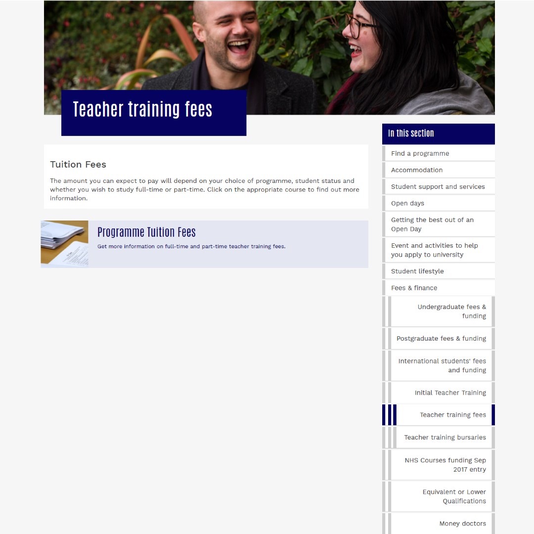
A great example within student finance was a ‘Teacher training’ section, a mini-directory of two subpages. One of these was nothing but a link back to undergraduate fees. The only thing of value among the three was funding. Yet, instead of undoing a knot, we’ve gone and doubled it.

Another of our handicaps has been governance, where departments start creating pages for things we already have.
We had six identical pages called ‘How to pay your fees’: two in our student finance section, two in our international section, and two for current students. So poor for users, so poor for SEO, yet so easily avoided.
Student finance wasn’t just a ‘optimise’ job; it needed a revamp from the ground up.
Know your content
In my 2018 IWMW talk, ‘Hand’s off, it’s ours’, one of my golden rules was ‘know your content’.
Student finance was an excellent demonstration of why that’s important.
Wading through all 85 pages of student finance was hardly a thrill, but it had a purpose. Once you understand how a particular information set works, it becomes easier to determine what structure works best for it.
For student finance at Greenwich, it was clear that the only thing that needed segmenting was fees. Any structure that split everything at ‘undergraduate’ and ‘postgraduate’ was bound to run into problems.
If you branch instead at ‘Fees’ and ‘Funding’, you can split fees however you choose and centralise everything else. That’s really what we needed.
Following this, you end up with something like the below:
BEFORE (SAMPLE):
- /finance/ug/fees
- /finance/ug/funding
- /finance/ug/how-to-pay
- /finance/pg/fees
- /finance/pg/funding
- /finance/pg/how-to-pay
- /international/help-and-support/fees
- /international/help-and-support/funding
- /international/help-and-support/how-to-pay
AFTER
- /finance/fees/undergraduate-fees
- /finance/fees/postgraduate-fees
- /finance/fees/international-fees
- /finance/fees/how-to-pay-your-fees
- /finance/funding-your-studies
We managed to reduce the 85 pages down to 30. Much more like it.


Digital optimisation
Of course, there was plenty more we could do beyond what was merely structural.
I merged content where it seemed sensible. Two short pages on disability allowances and government grants were both directing to gov.uk. Merging these into ‘Students with additional needs’ served both purposes.
Scholarships were another issue. The problem with scholarships is that they’re normally named after a scheme or a benefactor, which gives no clue to what they are or who they are for. The ‘John McWilliam Scholarship’ could mean anything.
We were frustrating users by presenting these in accordions. Not only were the titles unhelpful, there was also no way of knowing which awards might be relevant unless you selected every dropdown and deciphered the prose.


If marketing is about getting the right message to the right people, we weren’t doing that.
Under the new section, each award has its own page, using a set taxonomy to make them easily scannable. On the landing page, a keyword-heavy description shows at a glance whether the award is relevant to full-time or part-time, home or international students.
Users can now investigate what they know is useful and ignore what is not.
Getting buy-in
The hardest part of all digital transformation is getting support for what you want to do. Some people don’t like change. Others aren’t necessarily keen on letting us do what we do best.
Thankfully, that hasn’t been the case at Greenwich. Once this became something I’d set my mind to, the student finance manager was on board from the start. He wanted it to be better for students. Our Web Team has been supportive as well. You can’t ask for more than that.
Our web presence should be about users first. But if there are benefits for us behind the scenes, that’s a bonus. The structure of the new section now mirrors how the student finance team roles are divided. You don’t always find this symmetry, but it’s now much easier for that team to review and maintain.
And just as important, they are keen to take responsibility. As I described in my talk last year, governance is hard to get right. While there are ways of making it easier (such as creating a shiny new section), you need people who are engaged and who take responsibility to make it work.
It would always be easier to remove student finance content out of sections it didn’t belong when you have a finance manager prepared to take overall ownership. Perfect.
Your reward is that you no longer have to worry about maintaining material via three different departments. That’s going to improve things for all of us.
Initial results
The new section has only been live a week, but the stats look promising so far.
Visitor traffic to the section is roughly on par with January, despite it having less than half the number of pages.
The average bounce rate across finance content for the second half of 2018 was around 45%. The first week of the new section showed 25%. Pages that direct to gov.uk or Student Finance England seem to be successfully routing traffic to those places.
In an area such as this, with no obvious call-to-action, the metrics become a mixture of quantitative and qualitative factors.
Ideally, the new section will help to reduce enquiry numbers and improve the enquiry handling process through easily locatable information.
Equally, we want to boost recruitment by drawing attention to the sources of funding available and improve student experience by making our hardship fund and debt management resources more visible.

The plan with all of this was to begin in a visible place and use it as an example of how I could work with other teams to streamline and optimise their web presence.
Time will tell, but it looks to have been successful, and I very much look forward to more!
