For university websites, there’s a time to be creative and occasions when we should just stay clear.
Admittedly, creativity is open-ended. Sometimes it’s about original ideas or making something viral. Sometimes, it’s the slogan – the power of the copy.
For web, I find it’s the marriage between design and simplicity that helps you get the right message to the right people.
For universities, this is tricky – not because there aren’t good designers, but because it can be difficult to persuade everyone that simplicity matters or that their audience is not the top priority.
Universities care about recruitment, but also about research, news, events, compliance, and beyond. It gets extremely political. Thus, there is always a temptation to pack more in rather than strip away.
Below are a few thoughts about where it might be better to be ‘creative’ and when it’s better to leave it alone.
When to be creative
Homepage
Few universities are emboldened to speak to one audience, but when they are it’s a beautiful thing.
Sunderland won the accolade for best website at the HEIST awards last year and it’s easy to see why. The site is wonderfully clean, contemporary and conversion-centred.
It’s so easy to overload users with choice. How simple Sunderland makes life for its target audience.
Student testimonials
Student X had a great time, made good friends, etc. Great. But once you’ve seen one of these, you’ve seen them all. The downside with samey content is it only affirms a choice. It doesn’t influence or change minds.
Instead, think T.S. Eliot’s ‘The Naming of Cats’. What’s the one thing that will really, REALLY make your university stand out from the crowd? Like this.
Course pages
Like it or not, these will always be packed with stuff. Guidance from HEFCE (now the Office for Students) demands more info, not less. On top of this, we need to get people to apply or visit.
Here, simplicity is not an option; we must design around complexity. At Greenwich, we’ve number-crunched some of the stats into pie-charts, which look very neat.
When to avoid being creative
Services
Universities love brand names for services, but these do not work online.
At Greenwich, our help for disabled students is called *AccessAbility. Aside from the special character causing accessibility issues (oh, the irony), it’s not even a proper word, so every digital device will attempt to correct it. We also call our business services ‘business and enterprise’, which sounds more like an academic department.
For services, say what it is. Keep the frills for pitches and pamphlets.
Addressing audience types
Another tendency of HE is to try and speak to multiple audiences at once, such as prospective and current students, or students and employers.
With a bit of thought and careful planning, you can get away with this. When you can’t is when you try and get woolly about who you’re addressing.
We were devising an ‘Information for Parents’ page recently. Somebody suggested calling it ‘Friends and supporters’. That’s what most universities call their donors!
Know who you’re addressing and be crystal clear about it – especially if they aren’t the target audience elsewhere on the site.
Video straplines
Video content is everywhere now, and we have to earn views or risk it being ignored. Last year, Greenwich experimented with triple-word slogans to promote testimonial content. ‘Promoter. Instigator. Achiever.’ Etc.
I wasn’t keen. That vacuous stuff might work for a Lucozade billboard, but it won’t make you watch a video.
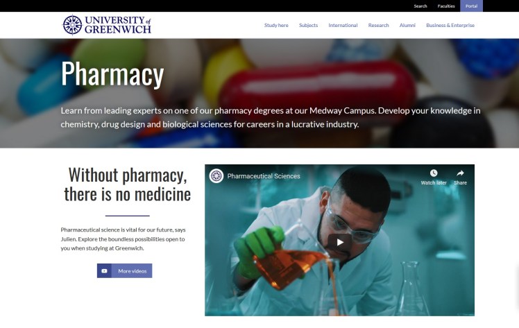
For me, appeal comes from students’ own stark, confrontational passion in their subject. I’ve heard a Geography student say, ‘we’re not doing enough to save the planet’. I’ve heard a Chemistry student say, ‘THIS is the essential science’. I’ve heard a pharmacy student say, ‘Without pharmacy, you have no medicine’. Edgy. Relevant. Those will do nicely.
Digital Shepherds
Sometimes I roll my eyes when I’m asked about ‘standard industry practice’ and wonder why we’re so concerned about following everyone else.
But when it comes to some of these later examples, I find it’s sometimes a relief to be able to defer to industry standards. If every other university calls their services ‘Business services’, you can bet it’s for a reason. If you reinvent a wheel and create an oval, you’re in trouble.
Meeting web user needs in HE requires simplicity and straight-talking. It’s also useful to know when and where style works and where it doesn’t. If you get that right, you’re bound to see results. I suppose the trick is not to be digital sheep, but digital shepherds.
